UXUI Designer | Product Designer |
Engineering Perspective | Business Mindset
Tiny Cottons Redesign
Website Redesign
Tiny Cottons
Redesign of a children's clothing website.
A bit about Tiny Cottons
Tiny Cottons is a children's clothing company. Their main source of business is through their online shop. They have three stores, two located in Barcelona and one in Madrid. Their main products consist of clothing for both kids and babies. However, they recently released a line for women and continue to add accessories as well as toys and books to their available products.
What are the pain points?
I started by doing user tests to see the pain points on the website. I consistently found the following problems.

1. Shopping Cart Icon
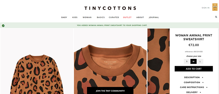
This was, by far, the most consistent problem I saw with users. The shopping cart icon is a yellow rectangle with two eyes. Some users thought it was a smiley face, others thought it was the company's logo. Needless to say, it was not conveying its intended function as the virtual shopping cart.
Although it is fun to play with different icons and images, it is more important users have a clear understanding of an icon's functionality.
2. Search Bar
Where is it? When users wanted to search for an item they had trouble locating the search icon. The icon is a small magnifying glass in the upper-righthand corner.

3. Filters
There aren't any. There is no way to filter by color, price, size, etc. Users wanted a more effective way to narrow their results when browsing.
If you want users to purchase items, make it very easy for them to find what they are looking for.
4. Baby vs Kid
What is the difference? Among the various tabs on the home navigation bar, Baby and Kids are listed.
If you have a two-year-old is it a baby or a kid? When do you technically become a kid? I don't know. Neither did the users.
5. Matching
After having spent some time on the website, users found there were matching items available. Some of the same items were available in babies, kids, and women's sizes. Some items were only available in two of the three sizes. And some items were specific to each category. The problem? There is no way to know what is matchable unless you spend a significant amount of time on the website.
It's a great feature! Show it off!
6. Item Added to Cart
Although a message was displayed when an item was added to the cart, most users missed it. Can you see it?

User Testing
The Redesign
Homepage
Aside from some minor shifts and relocations, below are the main changes.
-
The shopping cart icon now resembles a shopping bag. (1)
-
The search is now much larger and more recognizable. (2)
-
The Baby and Kids tabs have an age range (3)
-
There is a new section dedicated to matching items. (4)
-
The Basics tab was a bit confusing to users. As it consists of basic garments such as undershirts or baby onesies, I decided to relocate this tab as a subcategory within each main category.
-
The Outlet tab, although it appeared red in the original design to attract attention, many users thought this meant they were viewing that specific page. It is now black in the redesign. (5)
-
The Curated tab was changed to Featured Brands, to more clearly express the content present in this category. (6)
-
The images are split up into recognizable sections, making it easier to understand what to click and where it will take you. (7)

Filters & Location
-
Filters (1)
-
Color
-
Price
-
Size
-
-
Sort (1)
-
Price highest to lowest
-
Price lowest to highest
-
Most popular
-
Most recent
-
-
Location
-
Your location within the main navigation bar is highlighted (2)
-
You are shown the category you are viewing using the left navigation bar. (3)
-
You can more easily switch between styles using this navigation bar
-
-
You are given breadcrumbs or the steps you've taken to end up in your current location, on the left above the navigation bar (3)
-

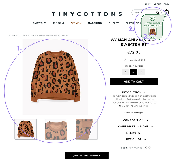
Product Page
-
It is much easier to see the product pictures and to switch between views (1)
-
The Added to Cart notification is more visible (2)
-
Undo button is present in the Added to Cart notification (3)

The Results
The good, the bad, and the ugly
I performed more user testing to find out what was successfully improved and what remained a pain point.
The filters were a big hit. They instantly made searching and browsing easier. I also found it allowed users to find matching items quicker. Those interested in matching outfits headed straight for this tab. Some users who hadn't intended to purchase a matching outfit became interested in what this section offered. However, I found the matching tab may be clearer with the title, Matching Outfits. Some users were unsure about what they may find on this page. Furthermore, I think it could be more compelling to show this feature off on the home page, enticing users to browse the matching items section.
Users did not have any trouble navigating the site. I found, despite my efforts to increase the noticeability of the Added to Cart notification, it was not as effective as I had hoped. In the future, I believe blurring or fading the main page to draw more attention to the notification will fix this problem.
Similarly, blurring or darkening the background when applying filters may also be a point of improvement. Therefore, allowing the user to focus more clearly on the filters.
What I Learned
Clarity is everything
While aesthetics play an important role in design, it does not trump clarity. Cute icons and fancy typography are not effective if your user doesn't understand what to do.
You are not your user
While some things may feel obvious, never overestimate yourself. You have different opinions, issues, thoughts, feelings, behaviors, etc. than your user. You must always gather research and user testing to find out who your users are and what they need.
We are social animals
Be careful when creating surveys and facilitating user testing. We are social animals. It is hard for users not to say or do what they think you want. Make sure not to give clues to the preferred answer in survey questions or give too much direction during user testing.
Tiny Cottons has no affiliation with this project and I do not work for them. I do not have access to any of their data that may have influenced their current design. I made this redesign purely based on my own research and data.
Attributions
Photos - Unsplash, tinycottons.com
User testing - Facilitated by AllWomen UXUI Design Bootcamp Fall 2019


